Of the 10 films that he didn’t end up disowning, five of Stanley Kubrick’s films have come under some controversy regarding the correct aspect ratio that they should be watched in. As we come to each of these titles in the Antagony & Ecstasy Kubrick retrospective, we shall consider the issue in each case. If not to “solve” the controversy, then at least to have some decent idea of what differences happen in each version, and why one might prefer one version to another.
Jump to Dr.Stranglove
Jump to Barry Lyndon
Jump to The Shining
Jump to Full Metal Jacket
Jump to Eyes Wide Shut
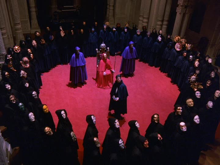
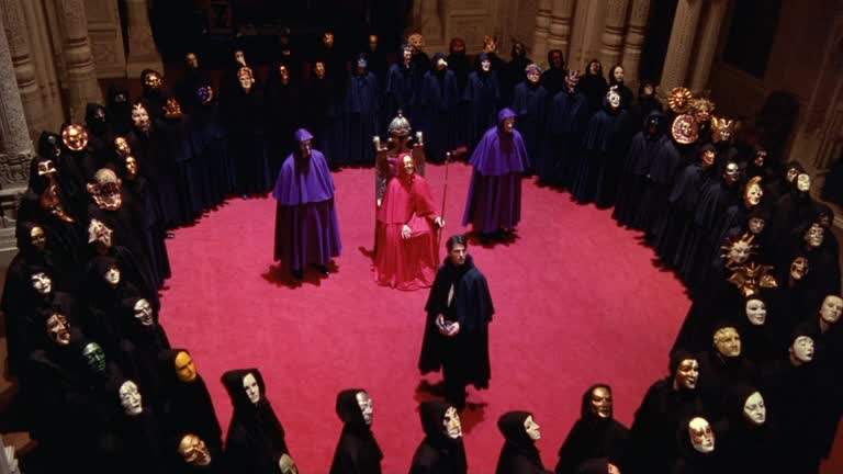
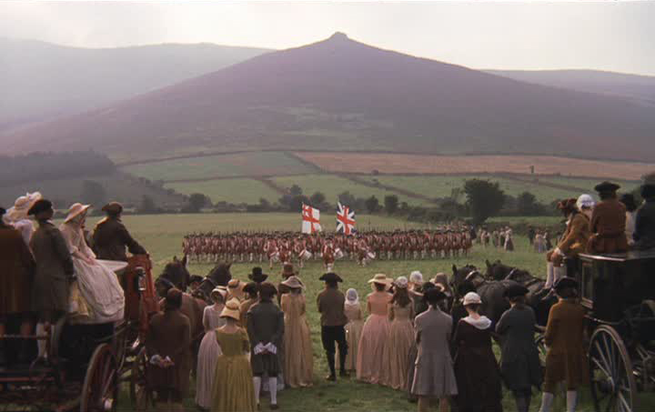
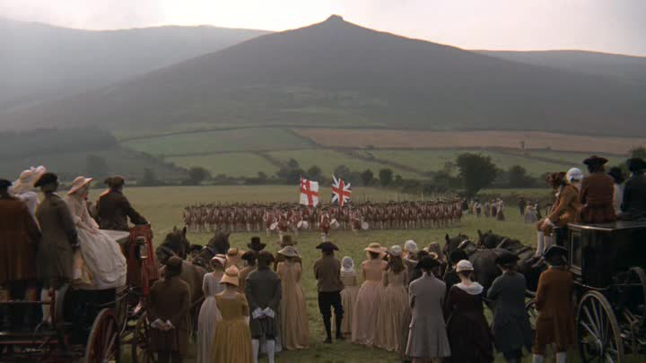
Dr. Strangelove, or: How I Learned to Stop Worrying and Love the Bomb (1964)
A relatively straightforward case: in 1964, the film was distributed with the intention that it should be cropped to a 1.66:1 ratio, though it was undoubtedly, in the United States, shown at 1.85:1 at times. Like most movies on VHS, this 1.66:1 image was cropped to 1.33:1, and the issue only shows up in 1999, when the first incarnation of the Stanley Kubrick Collection came out on DVD, with Kubrick having, allegedly, personally approved each of the films contained therein. Though it’s worth pointing out that Dr. Strangelove was an exact reprint of an earlier DVD – the label on the disc hadn’t even been changed.
This version included a “multi-ratio” print, which meant, in essence, that the bulk of the film was in 1.33:1, with some shots in 1.66:1. This was because the available print (which was not the long-lost original camera negative) had several sequences hard-matted. What I can only assume was bureaucratic idiocy led to the assumption that the open-matte version of the film was correct, even though the vast majority of widescreen films would have had un-matted distribution prints, and by 1964, the idea of a film in the square-ish Academy ratio is utterly preposterous. The 2009 DVD and Blu-Ray release returned the entire film to 1.66:1, and the whole affair should be considered a closed case now.
That said, it’s worth understanding precisely what’s going on here, and I can think of no image to more vividly and expressly depict the intention and purpose of the correct ratio than this one.

Barry Lyndon (1975)
A non-controversy of recent vintage. The movie was shot and released in 1975 in the aspect ratio 1.66:1, as pretty much everything made in Europe was at that point; there was even quite a to-do about making sure that in the States (where that ratio was vanishingly rare), projectionists were educated in exactly what that meant ant why matting the print to 1.85:1 – as would have been standard – was unacceptable. For years, it was available on home video in a 1.66:1 transfer, and this includes the 1999 “Stanley Kubrick Collection” DVD release that, according to Warner’s publicity, Kubrick oversaw personally. Then, in 2011, the first Blu-ray was released, and the film had an HDTV-friendly 1.78:1 transfer. This being released on the same day as Lolita, whose Blu-ray had the correct 1.66:1 ratio.
Simple problem, simple explanation: it’s wrong. Leon Vitali, who played Lord Bullingdon in Barry Lyndon at age 25, and went on to become Kubrick’s personal assistant, had long been the gatekeeper of the director’s films on home video, and he defended this as the ratio Kubrick had intended all along, but that’s obvious bullshit. Either Warner Bros. fucked up the HD remaster and called on Vitali to do damage control, or Vitali – long a source of dubious and easily-disproved factoids – fed them wrong information and it wasn’t discovered early enough to fix it. Whatever the case, the Blu-ray shows a minutely wider and noticeably shorter frame than any previous DVD.
That being said, the difference between 1.66:1 and 1.78:1 is not considerable, and while a handful of the compositions in the film feel noticeably crushed for headroom, I don’t suppose that it would really be possible to notice if one wasn’t directly comparing the versions. The narrower ratio is certainly to be preferred, particularly given the director’s precise compositions based on paintings from the 18th Century, but the film has hardly been rendered unwatchable, nor is it the only time that a transfer has silently been pushed to fill out the entire HD frame. Regrettable, but minor, particularly compared to the grueling complexities of the director’s three subsequent films on home video.

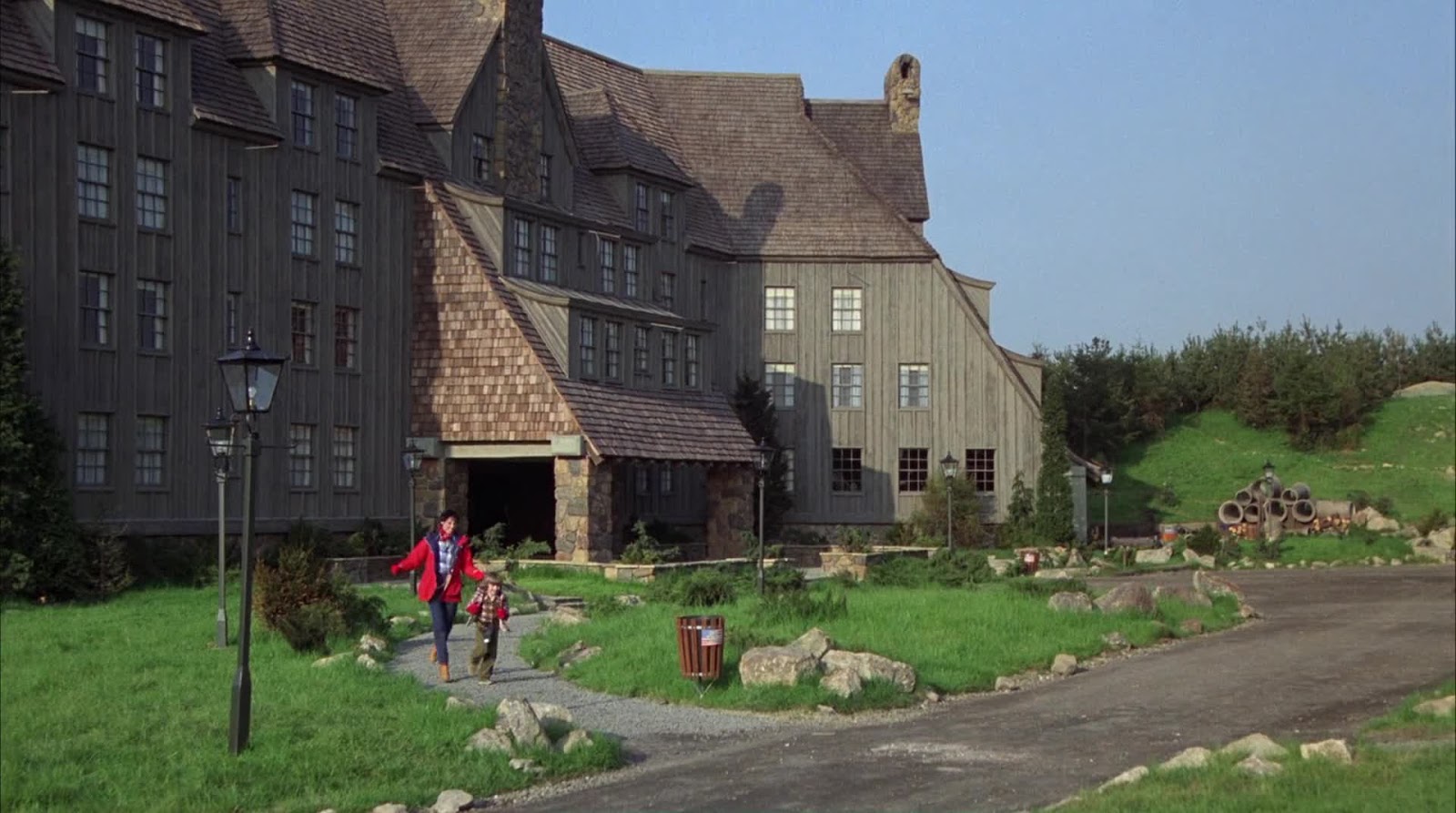
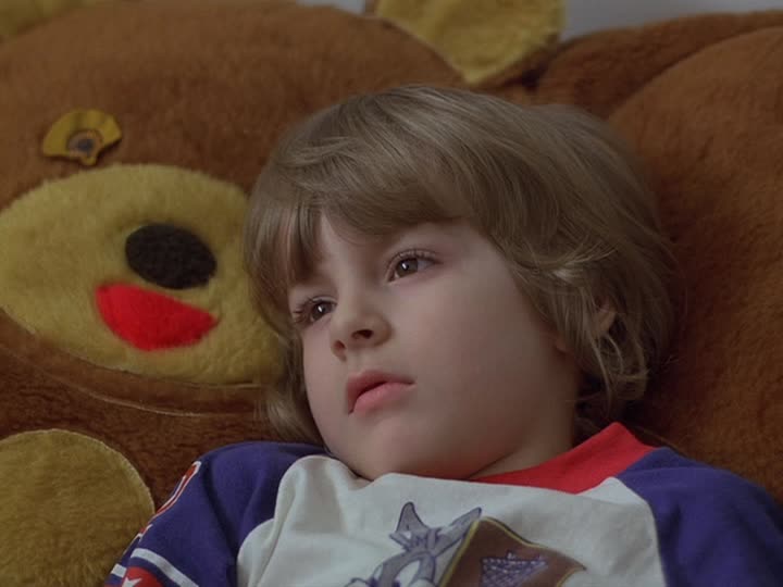
The Shining (1980)
Now we come to the fun part, where things become contentious and interpretive and just plain rocky.
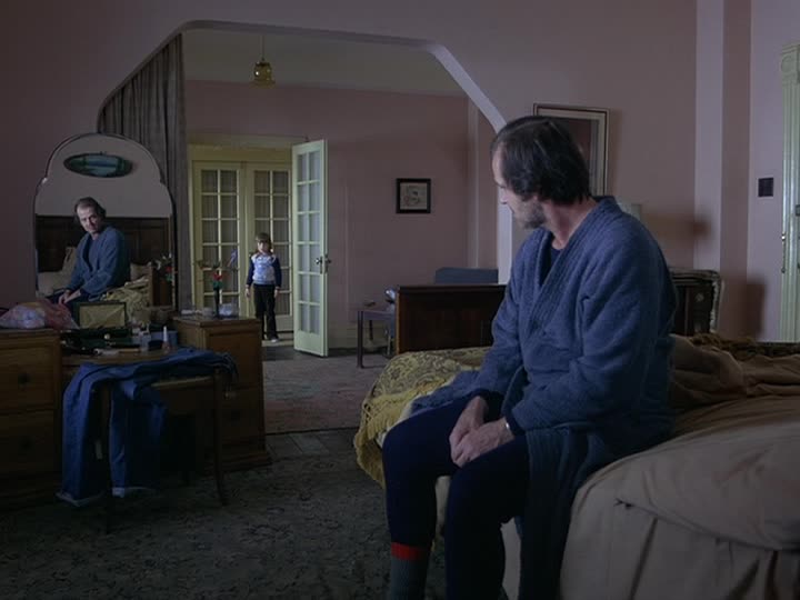
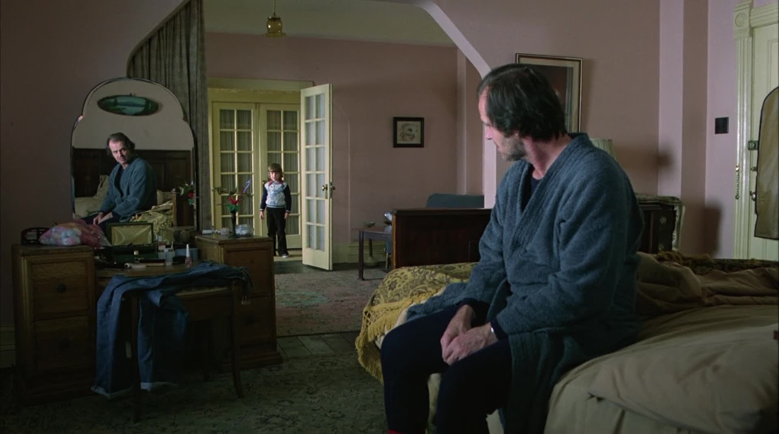
The situation is this, as I understand it: each of Kubrick’s three final films – The Shining, Full Metal Jacket, Eyes Wide Shut – was released in the United States theatrically in prints matted to 1.85:1, and in Europe to 1.66:1. And that would be all there was to it (and it already raises all kinds of obnoxious problems), except that when Kubrick passed away in 1999, he left behind a DVD box set released by Warner Bros. the following summer – a set which, according to all the marketing, was approved in every detail by the director. And in this set, those final three movies were presented in 1.33:1, the ratio of opening up the full camera negative.
And that would be all there was to it – the final wishes of a dead auteur – except that when the movies were released on Blu-ray in 2007, they were in the native aspect ratio of high-definition footage: 1.78:1, which the attentive will notice is not the ratio it was released in at any point in every country (fudging 1.85:1 down to 1.78:1 is, however, standard operating procedure for Warner Home Video). It’s a fair enough compromise between the two that I think we can fairly say it’s within the window of “Kubrick-approved” widescreen, but the point remains: didn’t he end his life in the opinion that the open-matte prints were the right ones? Don’t we have an obligation to honor his wishes?
Well, maybe not. The story has since appeared – I first heard it in 2009 or so, and I have no idea how long it has been kicking around – that Kubrick’s stated desire wasn’t for open-matte presentations as such, but for presentations that wouldn’t involve black bars taking up valuable real estate on the TV. So with widescreen televisions all over the place, maybe a copy that fills up the whole screen is right?
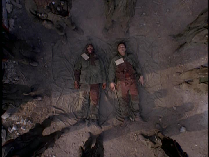
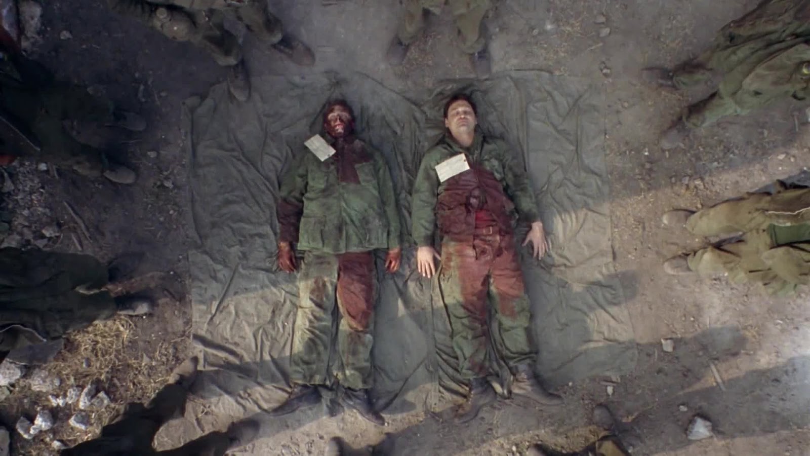
I’ll have more to say about that in regards to Eyes Wide Shut especially, but right now let’s stick with The Shining. Which, to be perfectly blunt about it, isn’t such a complex situation as all that; there exists a widely-disseminated image of a storyboard from the film’s production, with a note on it stating as bluntly as you please, “THE FRAME IS EXACTLY 1-1.85. Obviously you compose for that, but protect the full 1-1.33 area.” Case pretty well closed. The Shining ought to be seen in American widescreen; Kubrick was okay with it being seen in a standard ratio, but it wasn’t his preference. Done and dusted.
Still, for a lot of years – and those being this author’s formative years with the film – The Shining was “officially” a full-frame movie. So even if we have a reasonably definitive “answer” as we do not in the cases of Full Metal Jacket and Eyes Wide Shut, I think it’s still wholly worth investigating what changes happen to the film in is two ratios. For it does change; it is a subtly but distinctly different film, with its emphases altered in ways that favor, I think, both ratios, though never in the same shot.
(hereafter, the top image in a pair, unless specified, is always a 1.33:1 image from the 2001 Region 1 DVD, the bottom a 1.78:1 image from the 2007 Region A Blu-ray)
To begin with, the widescreen print eliminates the shadow of the camera helicopter:


But, on Blu-ray at least, it doesn’t completely eliminated helicopter blades at the wee top of the frame (and this I believe to be the knife’s-edge difference between 1.78:1 and 1.85:1):

(It’s nearly impossible to see when they’re not in motion; I’ve altered the image to emphasise the ovoid edge of the blade as best I can)
There are also some wholly generic and not remotely interesting-to-discuss moments where the open matte print simply has too much headroom in an unattractive, boring way:
On the flipside, there are shots where the open matte gives the composition more room to breathe:
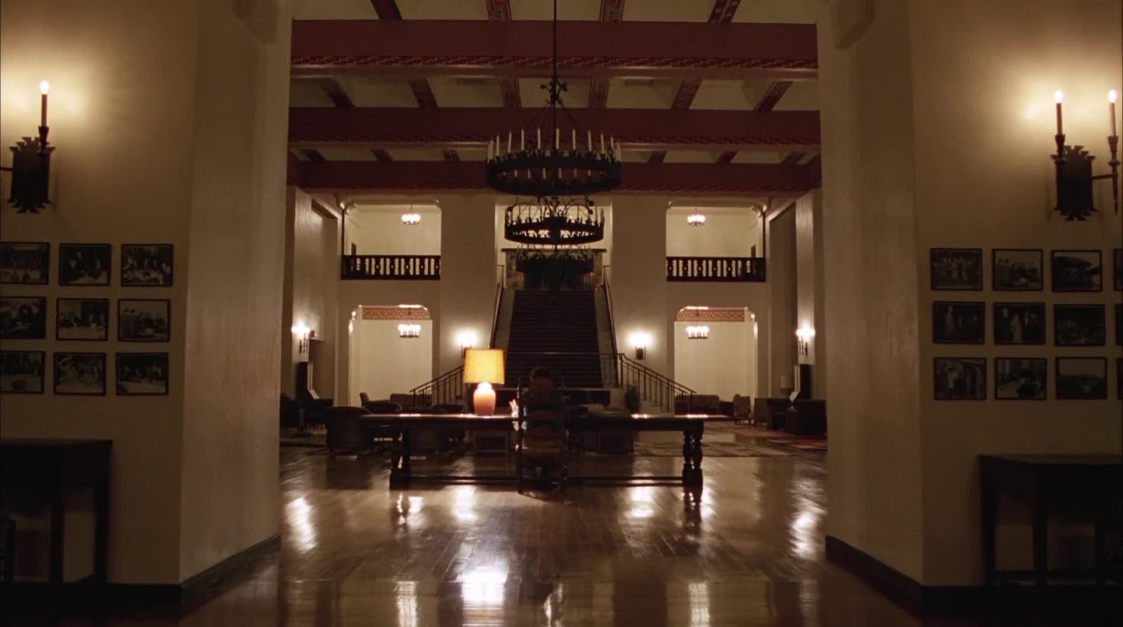
But there are times where the difference between the prints isn’t so crudely functional, but ties into the themes and storytelling. Generally speaking, the open matte version makes us more aware of the interior spaces of the Overlook Hotel, stressing the bigness of the building and the smallness of the characters within it. And given how the Overlook is a major character in the film, giving it more presence and authority within shots is, I think, an unambiguous good:


And yet, there are moments where the shorter, wider frame tends to focus the geometry of the image, forming boxes and traps around the characters, and this is also an unambiguous good:

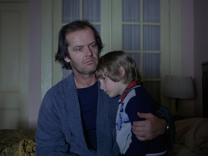
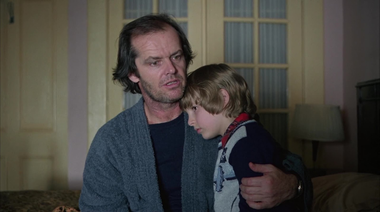
There are, meanwhile, shots where the difference between aspect ratios offers up a profoundly different experience, though not, I think, one that can be bluntly identified as “better” in one case or the other – this is especially true of close-ups.
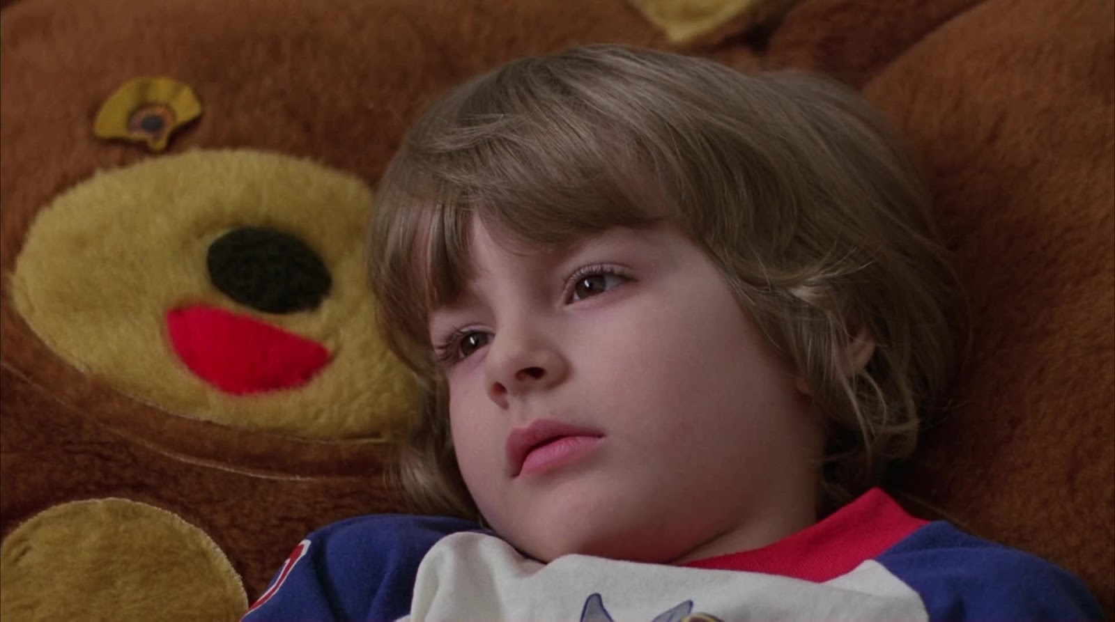


There’s a lot to be said for having Jack Nicholson’s angry face filling the frame in the widescreen image, but the the size of him in the open matte image is perhaps more imposing and leering. One of these presents an emotional threat, the other presents a physical threat – since Jack will be both of these things, it is fair that the different versions of the film underline them differently.
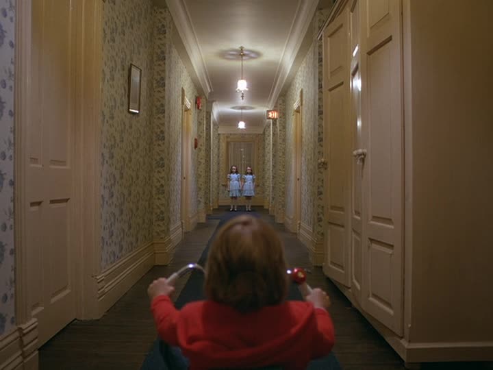
On balance, though, what matters most, I think, are the hallways. The Shining is a film where hallway shots are some of the most fucking important in the whole movie – the Steadicam for which the film is justly beloved mostly serves to draw all possible attention to the hallways, and their close cousins, the lanes of a hedge maze.

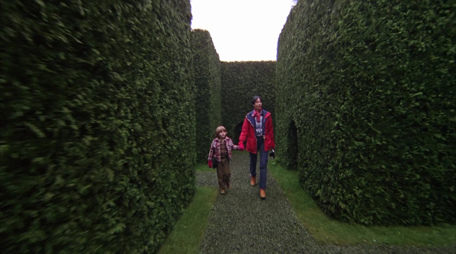

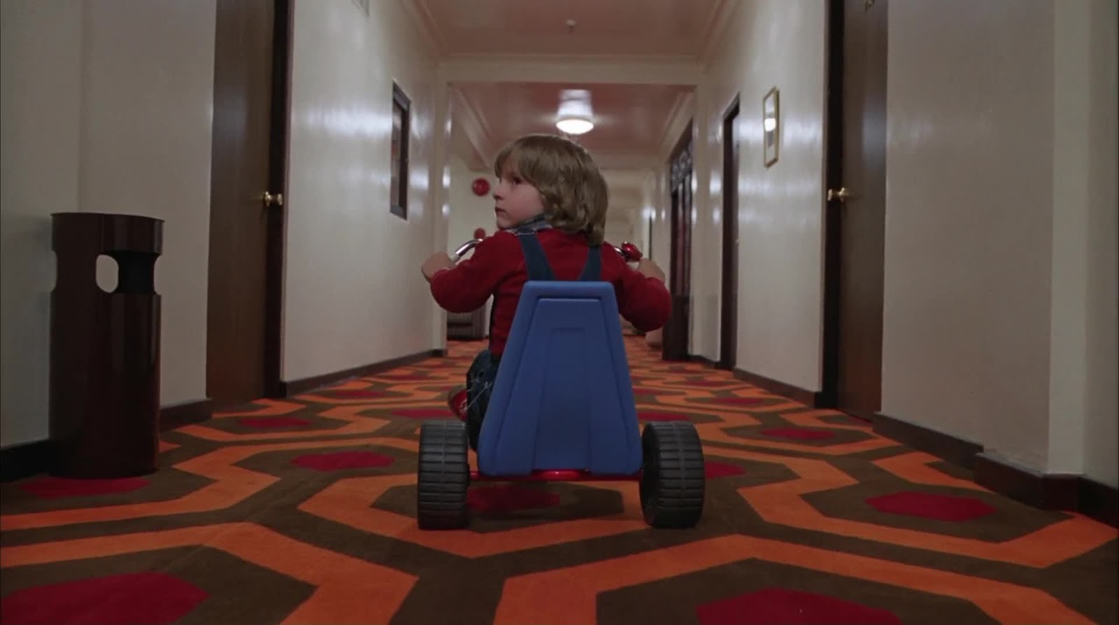
And maybe it’s just familiarity, but I am fonder by far of the open matte print for those shots, which stress the depth and height and right angles of the hallways like the widescreen simply can’t and especially in the shots favoring Danny, the open matte adds a sense of uncomfortable height that stresses his tiny size – and ours, since we are on his level.
Most importantly, though, I think the open matte is just plain scarier – in the moment in all of cinema that terrifies me the most, every time I saw it (I watched the entire film twice in 24 hours, one per ratio, to write this post, and it walloped me both times), the open matte, which is more full of diagonal lines and empty space, makes those freaky little girls that much more prominent, by virtue of making them more dramatically set off from the rest of the frame. And there’s also the matter of how much of Danny we see, but that’s just a matter of taste.

And I will last leave an exercise, one I cannot solve. The wonderful, infamous shot of the elevator opening to reveal a flood of blood looks better, I am quite confident, in 1.78:1:
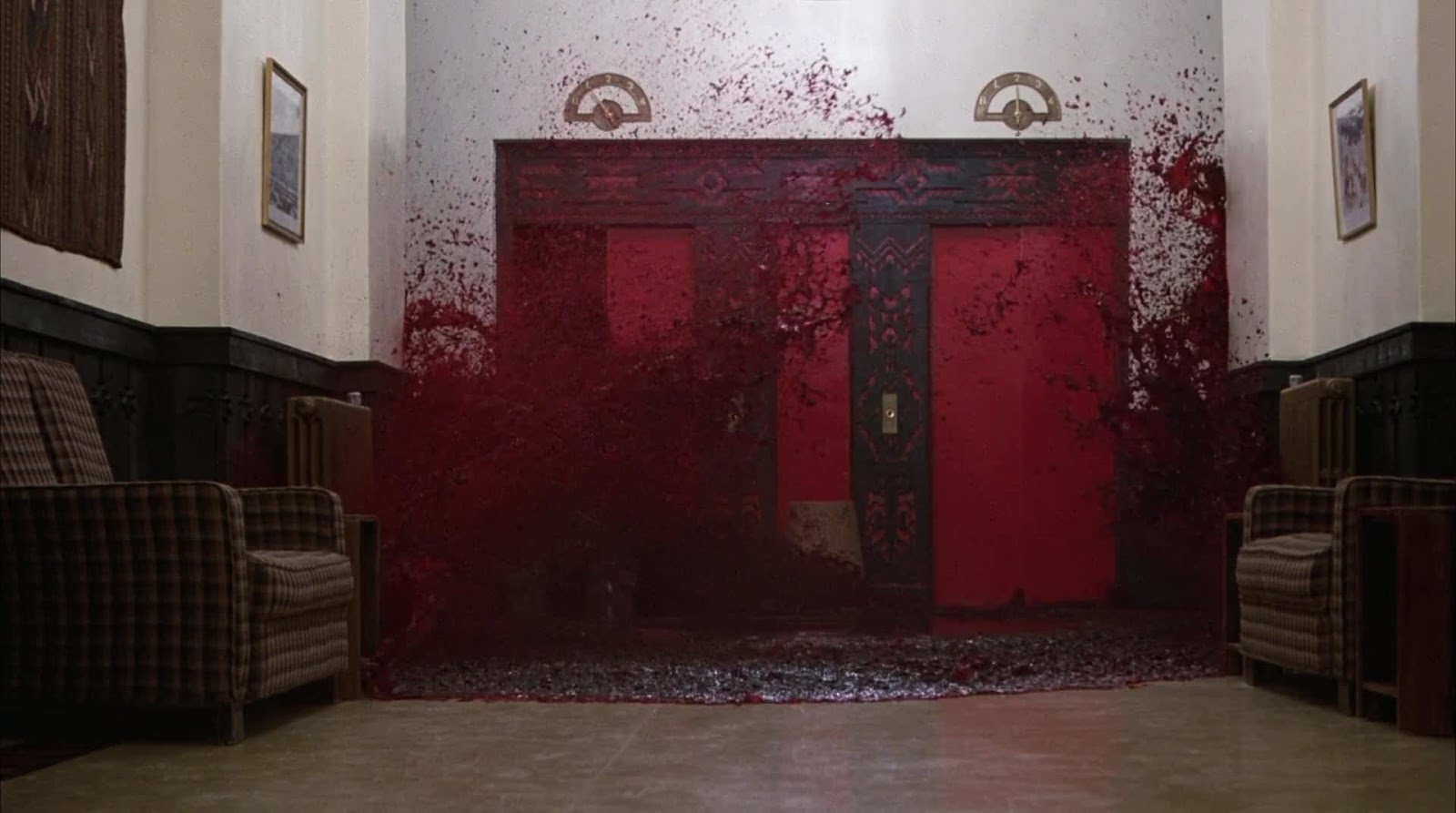
But in 1.33:1, we see a very prominent, distinct, and surely not accidental light fixture in the top of the frame, something that must have been put there deliberately and with a purpose in mind – you don’t just throw light sources in front of the aperture unless you have a damned good reason:
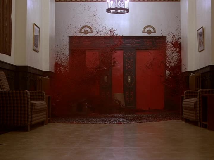
So tell me, dear reader: what the hell do we do with this one?
(I have no final verdict as to which aspect ratio “wins”, so hopefully you weren’t looking for one. Ideally, the film would be available in high definition in both ratios, but as long as it’s not, widescreen is surely the more important and authentic, and I will not lose too much sleep over it).
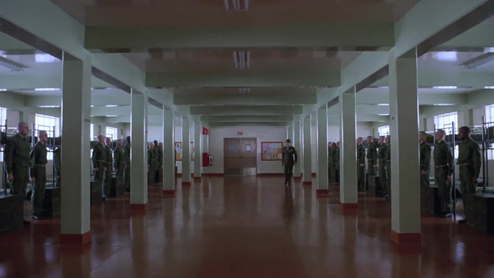
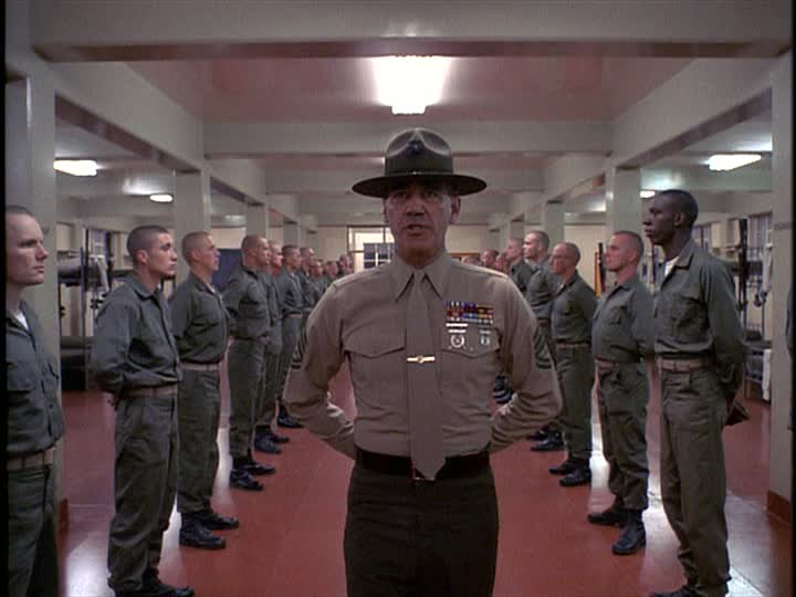
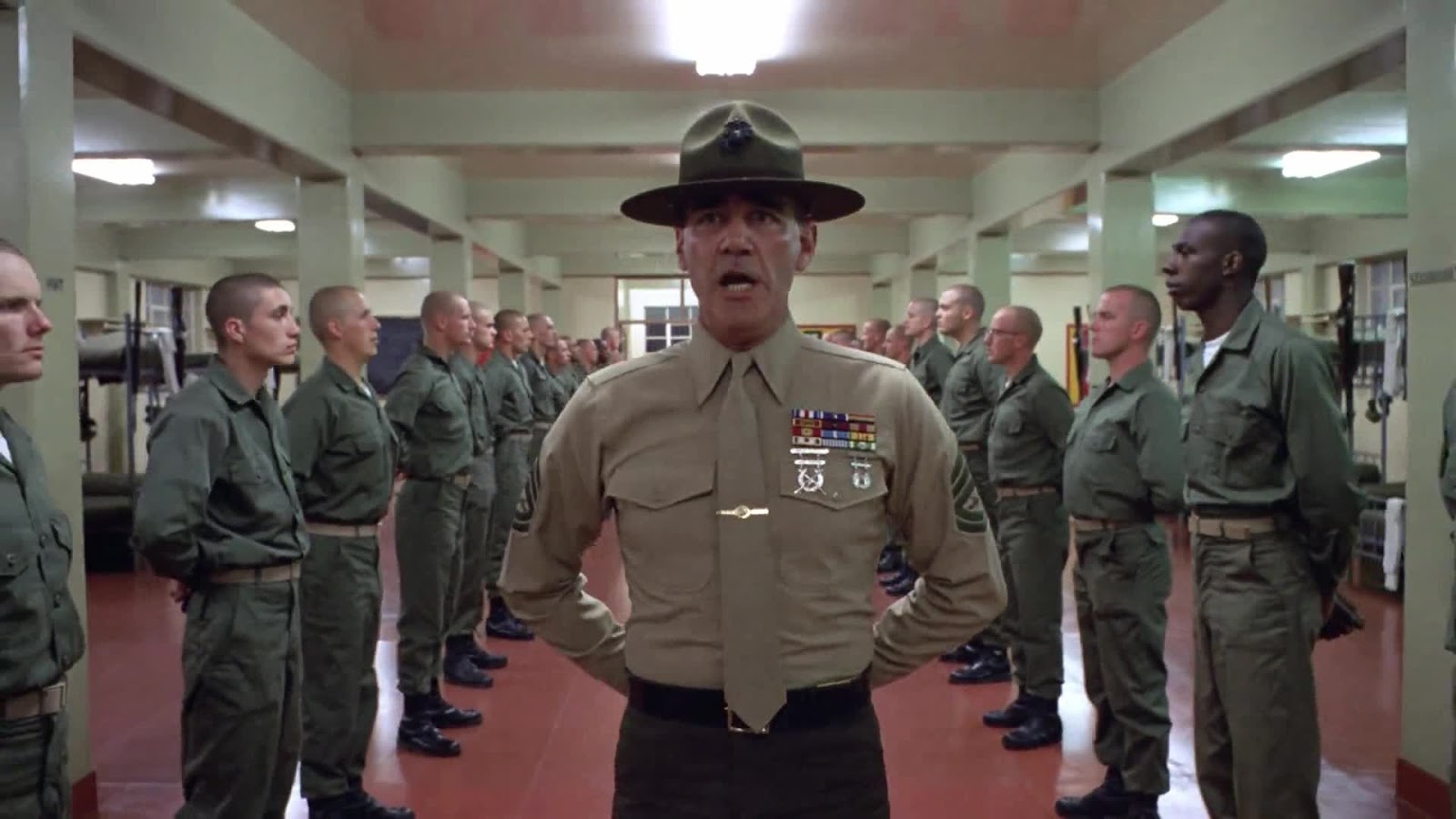
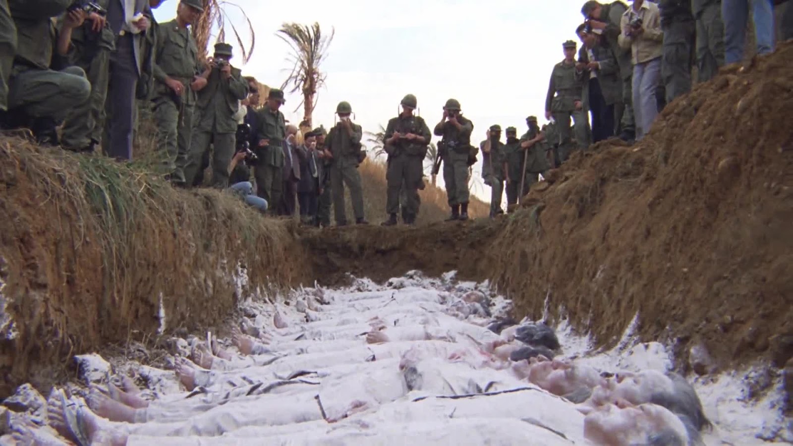
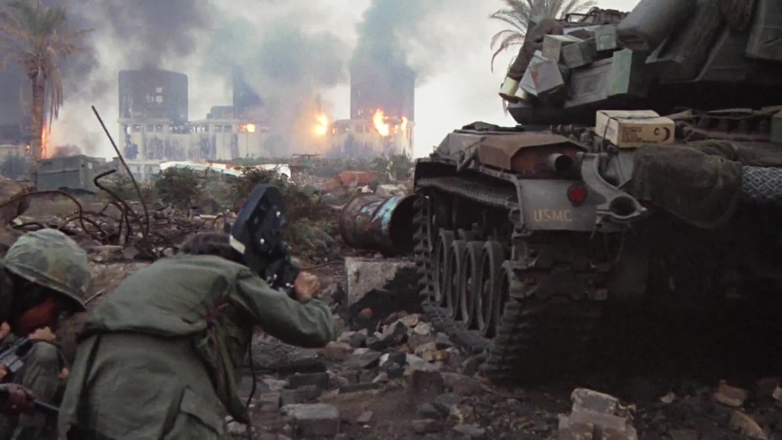
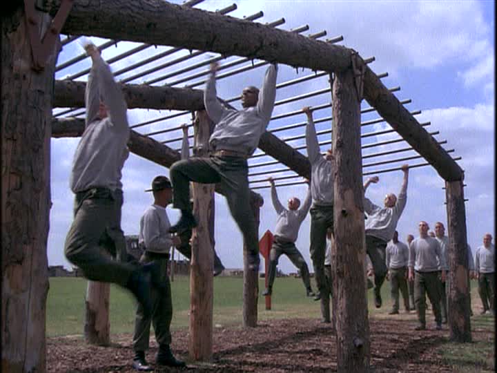
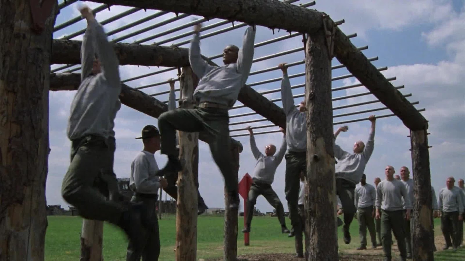
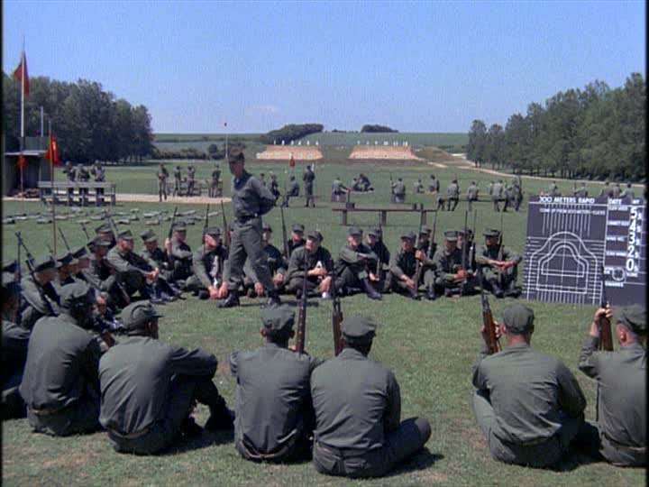
Full Metal Jacket (1987)
Basically, the situation here is the same as the situation that presents itself with The Shining, with slightly more context, and no convenient post-it notes to solve everything for us. In 1987, unlike 1980 (I do not know about 1985, when the film entered production), home video had penetrated the market enough that a filmmaker could plausibly assume that his work would have a longer life on televisions than in theaters and revival houses. So the argument that Kubrick was first concerned with the image which would be seen on televisions is at least plausible in a way that it barely was ’80. I tend to doubt it, but making a “perfect” open-matte composition was certainly more obviously critical here than it would have been when The Shining was shot, and so we have no tell-tale helicopter shadows, except for the ones that are supposed to have been there as part of the mise en scène.
Whatever Kubrick’s intentions, and whether or not he actually signed off on the 1999 DVD transfer before his death earlier that year (I very much doubt it), I am confident in my own opinions on the matter. The full-frame version (which noticeably shaves off the edges, of the widescreen frame, making “full frame” a useful misnomer) of Full Metal Jacket is more interesting and effective
(Hereafter, the top in a pair is always a 1.33:1 image from the 1999 Region 1 DVD, the bottom a 1.78:1 image from the 2012 Region A Blu-ray – and boy, is that ever a shitty transfer on the DVD. I’m a bit disgusted that I spent so many years referring to a version with such obviously unacceptable color timing).
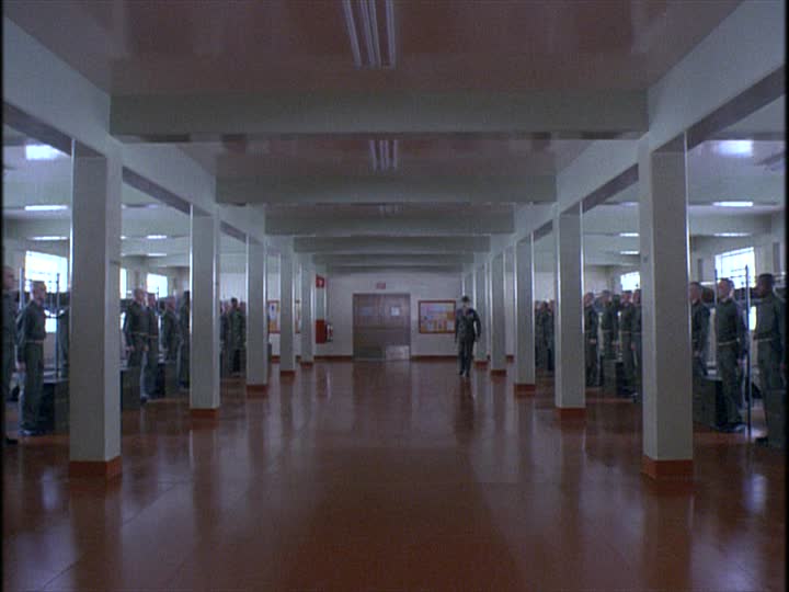
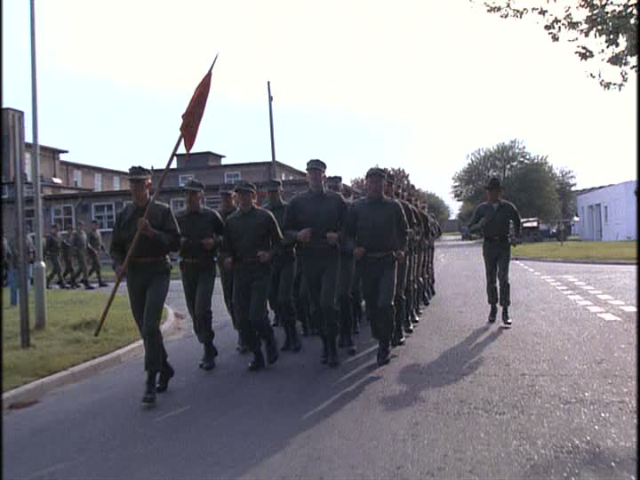
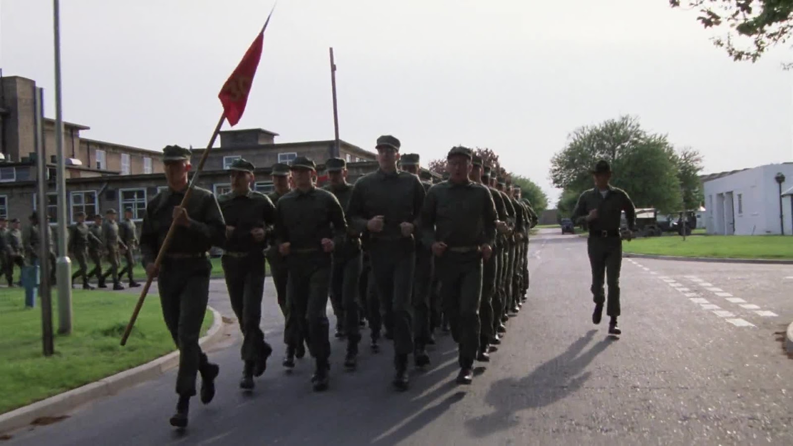
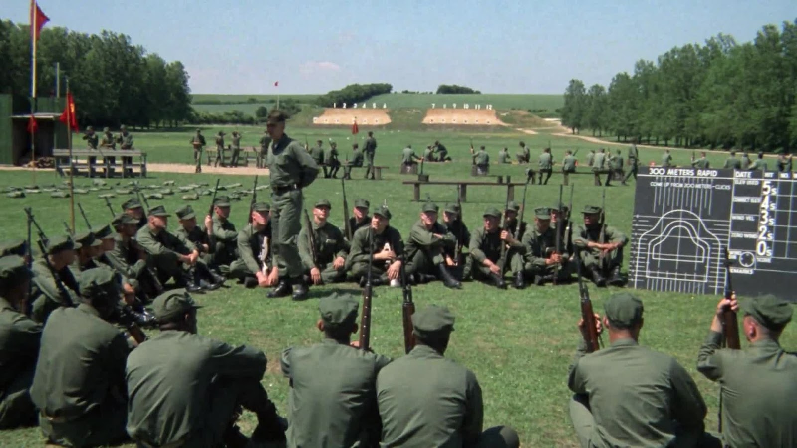
It’s not uniformly so, of course, since nothing can be easy, ever. In particular, the film’s most widely-beloved scenes tend to actually work better in widescreen: the basic training sequences, especially the interiors, gain quite a bit from the more rigid geometry enforced on them by the more elongated frame.
And there are a few places where only the visually illiterate could fail to perceive too much headspace in the full frame print.
But once the action switches over to Vietnam, all bets are off. In general, the film’s exterior shots – and the Vietnam portion of the film is dominated by exteriors – are not just better without the matte, they make for a completely different film, one in which the Marines are pinned to the middle of gaping, wide-open spaces, with the land behind them and the sky above them dominating the images in a way that doesn’t come close to happening in widescreen. And given the amount of work Kubrick went to in emphasising flat white skies, I think that anything which stresses the sky is to be preferred.

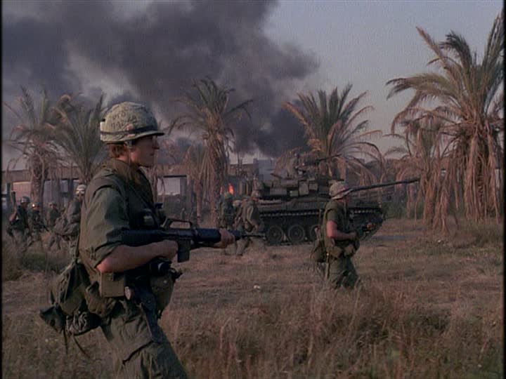
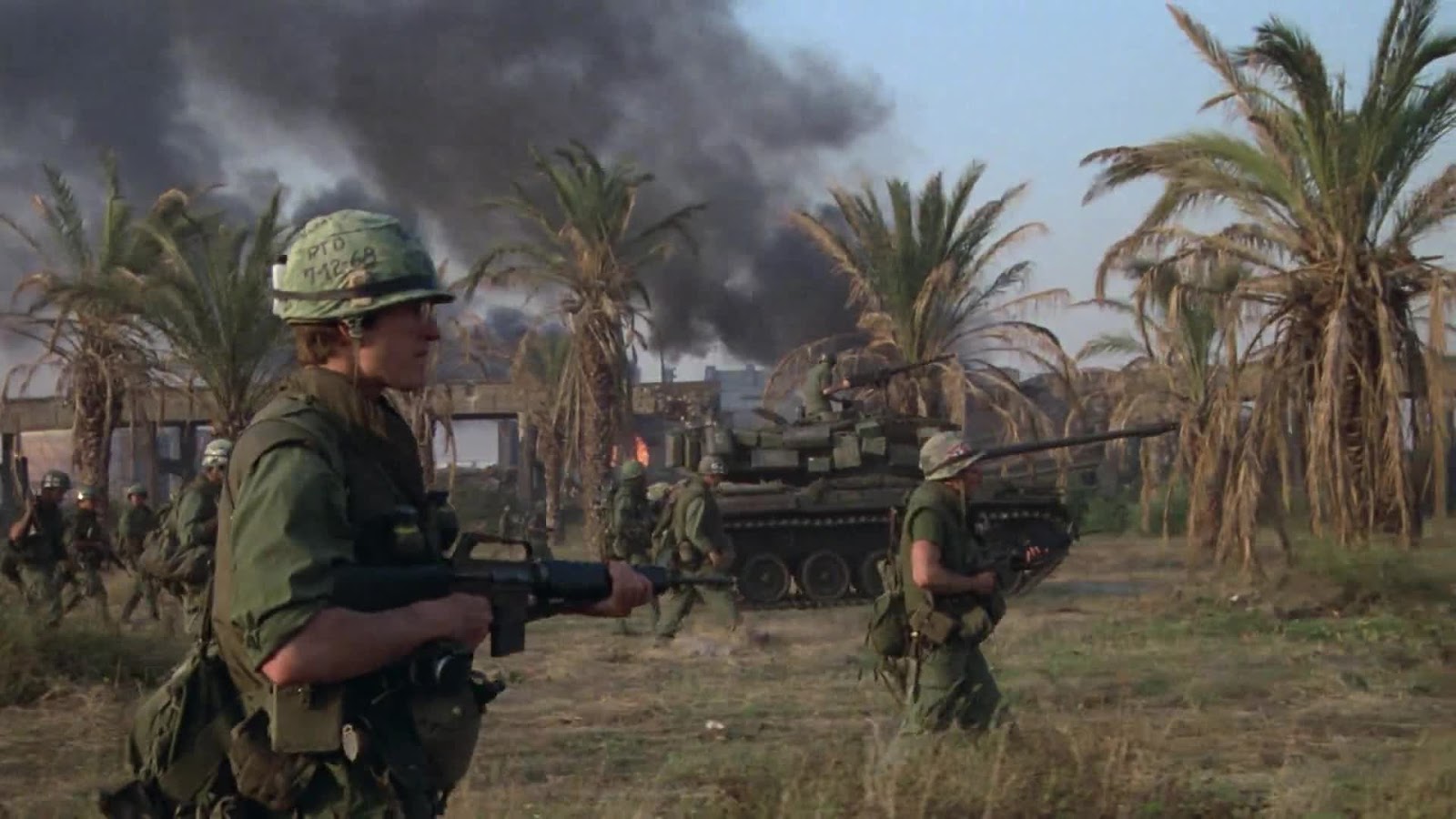

The widescreen compositions all work, of course, and they work very well. But they work in a very conventional way. The full-frame compositions also work, but they do so in a most distinctive, idiosyncratic style, something that’s more classical and comfortable to look at. I’m espousing unprovable opinions, of course, and there are always arguments against anything: even in the back half, there are shots which are plainly plagued by too much headspace that serves no purpose besides making images feel off-balance.

But on the whole, no contest. The visual quality of the newest home video editions is so vastly superior to any previous version that it’s hardly a contest which copy is actually worth watching, but that the full-frame version offers a more complete vision of the displacement of the human figures in the chaos of war, and that it’s frequently just plain more beautiful, of this I have no personal doubt. But as the “real” version can’t ever really be defined, it comes down to taste and the fact that the only way to watch the thing in an actual high-quality transfer is in widescreen, and that’s all there is to it.
Now, about that sound mix…


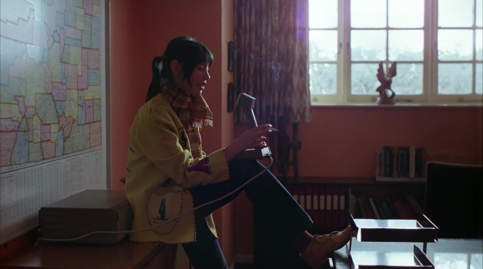
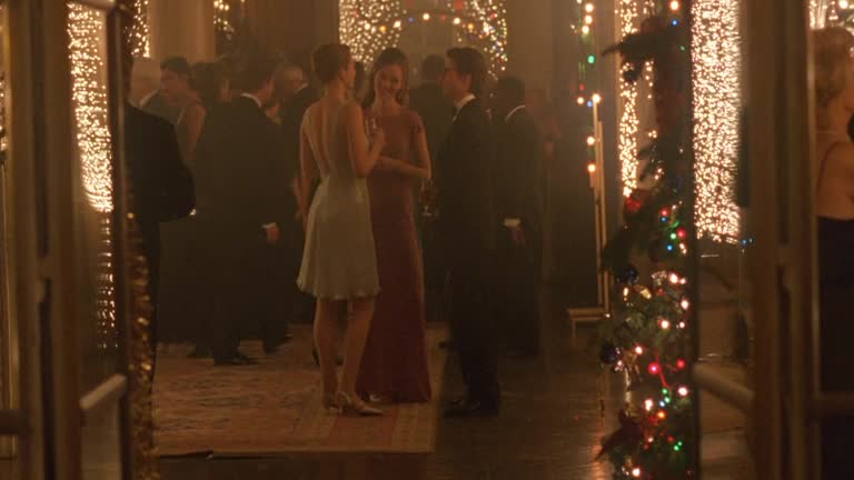
Eyes Wide Shut (1999)
The images following the discussion are Not Safe For Work
The problem with discussing anything about Eyes Wide Shut always comes back to a single point: Kubrick died before it was released, and we will never know how much tinkering he planned to do with it, and what, if anything, he thought about its eventual home video release.
Here, anyway, is what we know: in 1997, a new home video format called DVD was introduced to the market, and one of the biggest selling points of this new format was that it was going to be very friendly to the original aspect ratios of movies, as opposed to VHS, which was pretty consistently a fullscreen affair unless you wanted to hunt down the widescreen copy of a movie that was never as easy to scrounge up, and frequently did not exist. So it is the case that a film released in 1999 was surely going to come out on this medium, and it would be appreciated on that medium for all of time to come.
When EWS came out on DVD in 2000, it had a disclaimer appended to the beginning:
This film is presented in the full aspect ratio of the camera negative, as Stanley Kubrick intended.
Is that a lie? I honestly don’t know. By 2014, it’s become manifestly clear that Warner Home Video has told lies about Kubrick on DVD and Blu-Ray, no matter which direction the lies go.
All we know is that in 1999 and 2000, it was obvious to anyone with a sense for home video technology that the collector’s format, DVD, had popularised original aspect ratio copies of movies like never before. So there’s really no merit to the desperation gambit used by people trying to argue that Warner was right in 1999, and was also right in 2007 – all Stanley wanted was an image that filled the frame with no visible black bars. Clearly, consumers were all about images with black bars. But that assumes that Kubrick was up on home video technology. And there is some reason to assume that he wasn’t at all. He was a genius, but he was also an old man, and how many old men are whizzes at new AV toys?
At any rate, in 1999, if a filmmaker wanted his film to be on DVD in a 1.33:1 aspect ratio, it’s likely that he assumed that would be the ratio it would be seen in for the rest of time. So if that filmmaker expected his film would have a life of a couple of months in theaters, but an eternity on disc, it is very, very likely that he’d care mostly about the aspect ratio he was going to put on disc, and only secondarily about the ratio he put into theaters.
I can’t stress enough, this assumes that Warner was telling the truth on that 2000 DVD. And other than the apparent lack of reason for them to lie, there is not a single goddamn reason for us to make that assumption. They’re as untrustworthy as hell on Kubrick. Anyway, why there haven’t been home video releases – multiple ones! – with EWS available in multiple ratios (which was pretty much a standard feature in 2000, making it even odder that it wasn’t done here) is a bigger mystery than all the rest put together.
Other than, maybe, why all DVD and Blu-ray releases have so assiduously cleaned out the film grain that Kubrick went to such lengths to pump up.
Anyway, my own perspective is that I’d rather watch the ratio that a director assumed would be the one for all audiences to enjoy on video till the end of time, than not have black bars because Kubrick weirdly decided that it would be a distraction. We don’t know what that ratio is, unfortunately, we can only guess.
At which point, having spit out too many words to conclude that we’ll never know what Kubrick actually intended, I’m just going to turn to the movie, and own that my personal tastes are as unambiguous as it gets: outside of maybe a half-dozen shots throughout the whole film where there’s an ugly amount of open headspace, I much, much prefer the open-matte version. The widescreen version is absolutely fine, and it has some lovely compositions, but the open-matte Eyes Wide Shut feels like a series of 19th Century European paintings, exactly the right fit for this most emphatically Viennese of 1990s American films. The open-matte film focuses on the shape of the body (which is just about the most important thing this movie could focus on), the way bodies fit into interior spaces (the exteriors, I confess, look neither better nor worse in either ratio), and the shape of those spaces irrespective of the humans in them – the full frame movie is dominated by rooms in a way that the widescreen movie isn’t.
Basically, ask yourself this question: do you want a film that looks like an exquisitely handsome movie from the late 1990s with clear, vividly legible compositions; or do you want a film that looks like an Ernst Lubtisch picture from the 1920s with non-erotic sex in place of jokes? I know which one I’d pick.
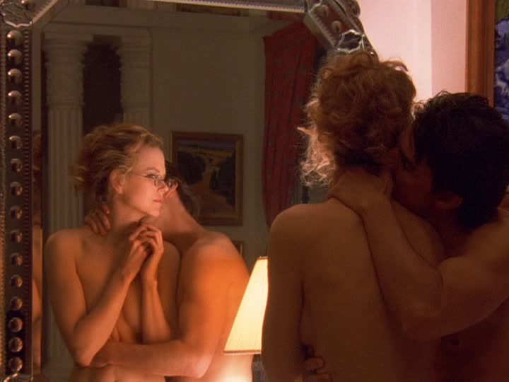
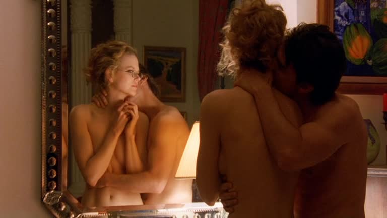
(Hereafter, the top in a pair is always a 1.33:1 image from the 2000 Region 1 DVD, the bottom a 1.78:1 image from the 2007 Region A Blu-ray)


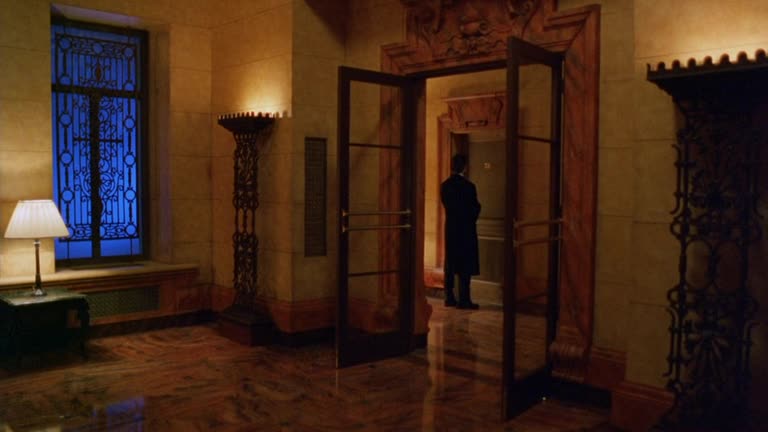


Following: note that in the film’s infamous mirror scene, the open-matte image has been significantly zoomed in. Allegedly, this was to hide the fact that Tom Cruise was visibly wearing pants.