

This week’s edition of Hit Me with Your Best Shot at The Film Experience, just in time for Katherine Hepburn’s birthday, is the 1955 David Lean movie Summertime, for which the actress received her sixth Best Actress Oscar nomination. I assume the fact that it is now the beginning of summertime helped Nathaniel in his selection, but perhaps not.
It’s the first film in this season of Hit Me that I hadn’t previously seen, despite loving both the director and the actor very much; I think I got it in my head that it was a low point for both of them, which is only – arguably! – true for Hepburn, and only then given an extremely specific definition of “low point”. It’s actually a rather snazzy riff on the “semi-repressed English/American tourist in Italy” genre that has been going strong for over a century now, helped out by some of the most legitimately intoxicating Venetian scenery ever filmed.
Before I get into that, though, an aside about everybody’s favorite contentious subject from the 1950s: What’s the Aspect Ratio? 1955 was the first year that widescreen cinematography was more or less “standard”, but not quite ubiquitous enough to be the de facto choice for every single theater. So at that time (and up until around ’58 or ’59), movies had to be protected for two different aspect ration: 1.37:1, the old Academy aperture ratio that was virtually the only game in town before 1953, and 1.85:1 (“matted” widescreen, with bars applied over the top and bottom of the boxier frame by the projectionist), the American standard for widescreen (in Europe, it was 1.66:1, which I prefer. But let’s not get on that tangent). There was also the super-wide formats CinemaScope and Cinerama and Technirama, but they’re a wholly different story.
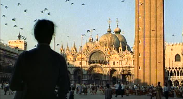
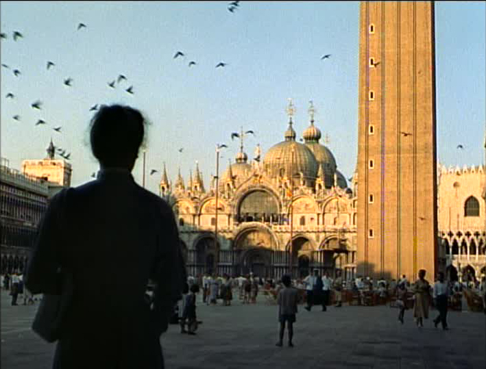
If you watch Summertime on DVD – which in the U.S. means the Criterion Collection’s 1998 edition – you’re watching it in 1.33:1, which is close enough to Academy that it doesn’t matter. And while we like to think of Criterion as being infallible on this subject, they’re not quite, because Summertime pretty clearly is meant to be seen in 1.85:1, judging from the gulfs of open space above people’s heads in every damn shot. If there’s a justification for this apparent lapse, it’s this: later on, David Lean professed a preference for the 1.37:1 open matte version, giving it the fairly inarguable aura of authorial intent. Looking at the film, I think it’s pretty obvious why he felt this way. Simply put, the 1.85:1 version of the movie is about people, the 1.37:1 version is about Venice, and as a direct result of shooting this movie, Lean fell in love with Venice for the rest of his life. I hold that he preferred the version that showed off the city to greater effect for that reason.
I’ve included two different ratios of my pick for best shot, to show you what I mean. Observe that the top one is anchored by Katherine Hepburn in the foreground, but the bottom, thanks to all that sky (and to a lesser degree, all that pavement), is anchored by St. Mark’s Basilica.
Now, either way, my motivation for picking it as best shot is much the same, but I wanted to give everybody a little lesson in the tiny shifts that can totally alter the way movie a functions visually; and as a visual medium, that changes its emotional function as well. I liked the version of Summertime that I watched very much; but I think I might have liked the 1.85:1 version even more. Next time, trying it with the “zoom” function on my TV. Or maybe just taping poster board on the screen. Either way works. And maybe I’m wrong: the open matte Summertime sure does make Venice look unfathomably pretty, and like most “Americans in Italy” stories, it’s the pictorial elegance of the buildings and art that causes the shift in the protagonist’s mind from which drama springs. Take away the scale of the city, and perhaps that vanishes. I honestly don’t know.
Anyway, let’s take a closer look at that shot. At this point in the movie, Hepburn’s Jane Hudson has been in Venice long enough to learn the classic tourist’s lesson, that all of these sights and their impressive history can be suffocatingly lonely when there’s nobody to share it with. Lean and his DP, Jack Hildyard, find a a great many subtly varied ways to communicate this idea, all of them isolating Jane in the frame and separating her from the glories of the city, and all of it comes to the fore in this savage composition, which is admittedly more dramatic in the open-matte presentation. Here is a sight as grand as anything Italy has to offer: a storied building in golden hour, birds flying in the air in the most opportunistically painterly and poetic way. And there’s Jane, a thick slate silhouette completely separated from everything else in the frame, both because of her distance from anything else on the Z-axis, and because, obviously, she’s so damn dark.
If we wanted to stretch a point, we could even point to that diagonal line slashing across the basilica, and say that Jane’s isolation is threatening to overwhelm the beauty that surrounds her; she’s projecting her shade across the building, if you will. But that is, maybe, pushing it; I think that the intense differentiation between planes in the composition gets the point across very neatly all by itself. The opening of the film is all about being in the one place you’ve always wanted to be, and finding how hard it is to enjoy it when you can’t share it and talk it out with somebody. A lot of shots communicate that idea very well, but this is the one where my breath caught a little.